I recently started Micki Wilde's online class Paint Happy and was inspired to create swatches of every single acrylic paint that I owned! In her first lesson she has an assignment where we create color palettes we like in our journals. Being the recovering perfectionist that I am, I really wanted to "see the colors all together" before committing them to paper.
I have.... umm... well... a LOT of paints! I even have them categorized by color. But still, when I'm painting, the ones in the drawers are out-of-sight-out-of-mind and the ones on my work table are... over crowded! So my idea solved two problems... Yay! I'll be able to see them all at-a-glance.
With my new swatches, I can create the perfect color combinations and play with subtle differences in certain colors until I get them just right! The top swatch is my favorite 70's junk jewelry combo... and right beneath it is the ultimate Sweet Tart palette!
Oh, and never fear, dear readers... I put the paint color and brand name on the back of every single swatch. Woot!
Heck, even the remnants from my project are juicy fodder for some other project... or they'd even make a great stencil!
I started a list in my journal of all the different places I can look for color palette ideas. The only problem is... that the possibilities are endless. Now where are my paint brushes? Wheeeeee!
website | contact | e-mail list | shop | the artist | gallery | licensing | publications | events | etsy
Showing posts with label acrylic paint. Show all posts
Wednesday, June 19, 2013
Wednesday, November 21, 2012
Going With The Flow...
Recently, I took Flora Bowley's online class... Bloom True. The basis of the course was to take "a groundbreaking and transformational approach to painting (and
living) that celebrates intuition, connects body, mind and spirit and
allows unique and expressive paintings to emerge naturally and
authentically." Much easier said than done!
The first thing we had to do was... let go! Creating layers and layers and layers of color. Alternating warms and cools... not worrying about the end result... just paint strokes and mark-making. Whatever felt good in the moment. It was tough... but I went with it.
Then it was more layers. Layers upon layers. Alternating with the warms and cools again. Still trying to keep the end result out of my brain. Still hard! But I went with it.
Then it was time to add contrast to my canvasses using blacks and whites. Ooooh, I'm liking that.
But now... is it too much? Darn it! So I went back to making layers and layers and layers and layers. And eventually it was time to find some imagery and do some masking. Still with no preconceived images in mind.... these are what my 2 canvasses turned into...
The funniest thing is that I can't even tell you what canvas came from what original because there were so many different layers that I mindlessly created without really paying attention! And the coolest thing was that I learned to let go a little bit more. Just a little!
Labels:
acrylic paint,
bird,
bloom true,
brave intuitive you,
flora bowley,
house,
layers,
michelle renee bernard,
tree
Wednesday, September 19, 2012
That's Affirmative...
In today's hurry-up-get-it-done-and-on-to-the-next-thing world, we often forget to pause and reflect on what is really important in our lives. I know that I am totally guilty of flitting from one task to the next, barely even taking a breath in-between. And my brain? Forgetaboutit! It's going a million miles a minute processing what I have to do, what order to get it done in, times the amout of days I don't have to get it done in... sheesh! Is it any wonder we're all stressed out?
So I took some of that oh-so-elusive time and made myself a few reminders. I wanted them to be a little more special than a note taped to my bathroom mirror, or an index card near the kitchen sink. So I found some corrugated cardboard boxes, cut them into rectangles and painted them with acrylics... each one having it's own personality for the affirmation it was boasting. I've placed them all around my house and they really do work. Go figure! Now that's affirmative.
Tuesday, June 19, 2012
I Love Painting... No Bull!
I've been painting a lot of backgrounds lately, being inspired by the process and just really getting into the details and having fun. Suddenly, between the pasted papers, oil pastels and brush strokes there emerged a face of sorts! And... no bull... I knew just what I was going to make of it!
Combining recent discoveries from workshops by both Mindy Lacefield and Jesse Reno — as well as my own tried and true techniques — I created this primitive yet whimsical pretty pink bovine piece.
I really enjoyed getting into the details and puzzling out how to make the painting work as a whole. I was loving the battle of chaotic elements inside and outside the figure and used different techniques to balance them out. I brought the face together with a light wash of pink. I added red to some of the feathers, but kept some of the imagery in others...
I'm very fond of that seredipitous peek-a-boo stuff! And I love all the texture that was created from the many layers beneath. Rubbing out the oil pastel outline really helps emphasize that.
The body was a little trickier. I wanted it to be pink, not just because the face was... but because it was also a nice contrast to the blues and teals of the background. But the pink looked really dull and plain. I had taken a soft shade of blue to re-paint some of the flower elements inside the bull and it gave me an idea... to fill the body with scribbles, doodles and graffiti of the same shade! I now love this technique and will definitely use it again!
The elements outside the bull were the perfect contrast and so I didn't mess with them very much. Adding a slight dark shadow around the animal was all it needed to stand out against these delicious, obnoxiously bright swirls of color!
Alternating shapes on the painting — like these squares here —really helped balance out the overall piece. I definitely have a tendency to go on and on and on with a single shape and try to break out of that habit whenever I can.
I am overly ecstatic with this piece and wish I could make another one just like it! But my process is so organic, I don't know if it would ever come out the way I intended. I guess I'll just have to play around and see if that ain't no bull!
Labels:
acrylic paint,
bright colors,
bull,
collage,
folk art,
jesse reno,
mindy lacefield,
painting,
primitive
Tuesday, March 27, 2012
Cheap Thrills...
One foam stamp, one pair of old blue jeans (almost on their way out), and some jet black acrylic paint were all it took to jazz up these favorites of mine. I was getting bored with them and felt like playing around. All I did was simply spread out some black paint onto a non-stick surface (I used Ranger's Craft Sheet here), and pat the foam stamp into the paint until it's completely covered. Then I stamped on the jeans, nice and firm... and that's it! Don't worry if the stamping doesn't come out perfectly, just dip a paintbrush into the paint and fix any parts you like. Ta-daa!
I had actually stamped on a pair of lighter jeans with white acrylic paint a few years ago and loved them... but alas, they don't fit any more. So I figured I'd try it again. I bet if I bought these at Anthropologie they'd be $249!! Cheap thrills work for me.
Labels:
acrylic paint,
claudine hellmuth,
foam stamp,
jeans,
rubber stamping,
studio paint
Tuesday, March 20, 2012
This Is Your Brain On Art... Any Questions?
Well, I'm proud to say that I am following my own advice. Now you must understand that this in itself is a major task! But I said I was going to draw something every day... and I have. I'm not saying I like everything I've done (thank goodness for the editing that social media allows), but I am just happy that I have begun a new creative journey and am ready for where it takes me. Here's a few of my favorites from the week...
This little squre-headed bull had been floating around in my head since Jesse Reno's class and was the very first drawing I made... all with my non-dominant hand. I liked him so much I cut him out and pasted him inside my journal. Oh, dear.... I hope he likes pink!
Little circus bear just started out as a round head. The very interested sun looking over him I added as a contemplative interaction for the sketch. Just trying different things.
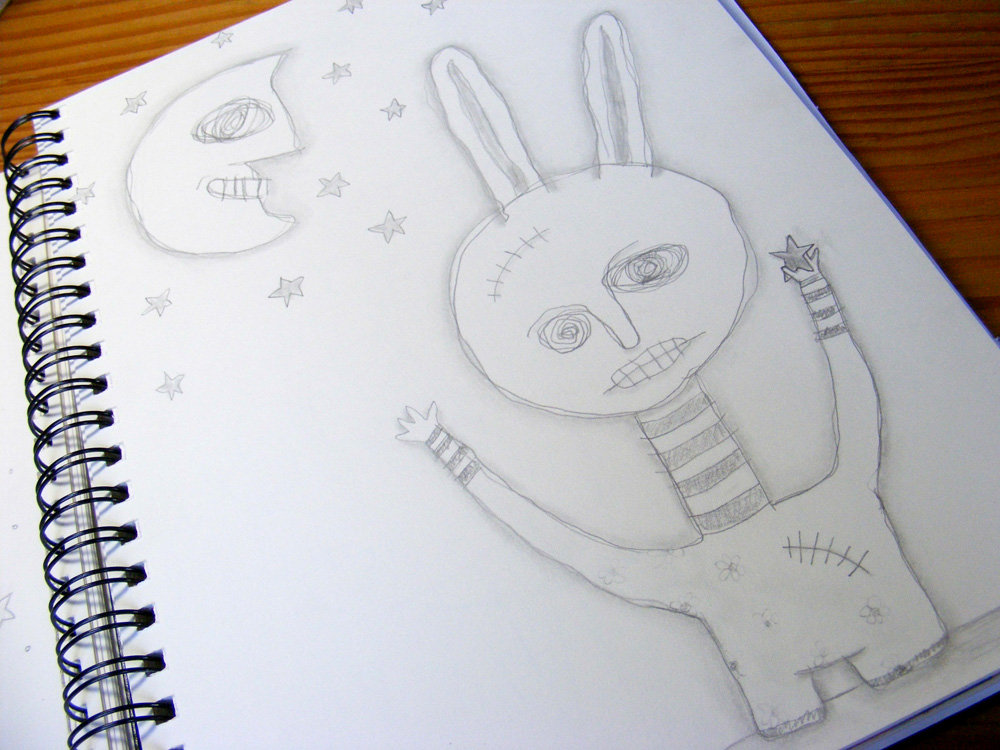
One single star caught by this primitive bunny makes him a happy boy. Again, just drawing what comes to me and not trying to force the direction of the piece. The moon and stars were all added after the bunny was "born". Still feeling out my style. I know it won't happen overnight... but I must say I am one impatient artist!
This sketch emerged from the desire to illustrate the stress related brain fog I currently suffer from. The little monster in her scrambled head makes her eyes all wonky, but she still holds tight to her heart. I liked this one so much, I decided to play around and turn it into a painting...
I stuck with my own personal style for the background because I didn't want to get too far out of my comfort zone. I know how frustrated I can become when I'm going into uncharted territory. I chose to make a very busy background, almost to create a total sense of chaos for the piece.
But working late into the night turned it into... well... ummm... uhhh... something a little different! I was actually employing some of the methods I learned in Jesse Reno's class and had covered up a section of the piece I didn't like. The color I chose looked like a hospital gown and not seeing her arms made it look like they had been severed off. So I went with it! I actually love the way she turned out! Just goes to show... I'd give my right arm for some artful play time!
Tuesday, December 20, 2011
Can You Sugar Coat It For Me?
Goody-goody gumdrops, and cotton candy too (of course)! After I had so much fun with my pop art ice cream cone, I decided to make a cotton candy version as well (actually, my brain has created a whole series of candy art... now I need more canvasses!). And since cotton candy is all sweet and sugary, I thought that gumdrops would make the perfect accompaniment. But after I stared and stared at the finished piece, I thought the gumdrops looked a little naked.
So... I covered them with glitter! Big, fat, chunky glitter! Now they really look like gumdrops.
The final, final piece is totally sugary and 3-D! But I still can't decide if I like the gumdrops with or without the sugar. But that's how it is with original art.... sometimes you just have to take a chance. There's no "undo" button.
Labels:
acrylic paint,
collage,
cotton candy,
gumdrops,
painting,
pink,
spun sugar,
stars
Tuesday, November 1, 2011
Let's Play... Candyland!
Sometimes when I work on a project for so long, my soul just cries out for something completely different. And that's why I have a journal at the ready, at all times!
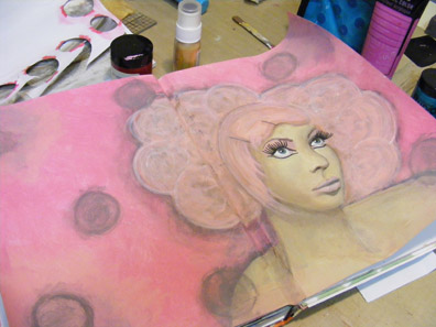
So I decided to let loose and try my hand at a paint-over... painting over an existing photograph. This one was so cool, I just loved the model... and her makeup... and her hair. I thought it would be an interesting starting point.
Using acrylics, I painted over the entire photo until every bit of it was covered.
Once I finished, the page was just begging for some kind of candy. I mean, her hair already looks like cotton candy—so why not go with the flow!
I decided on peppermint swirls... not my favorite to eat, but they sure do make for great art!
But they looked kind of flat on the pages and I wanted them to pop a little more. So I traced them in place, removed the pieces and added a light wash of acrylics to create a shadow behind them.
Voila! Very happy! Although I'm not sure where I'm going from here. But that's usually how it goes with me! It will be there in my trusty journal when the inspiration takes over. It was fun just to let go for an evening.
Labels:
acrylic paint,
collage,
journal,
lady gaga,
mixed media
Tuesday, May 31, 2011
I've Been Framed!
Lately I've been repurposing vintage frames I find at the flea markets and antique shops... and using them to showcase prints of my original artwork. Sometimes the frames need a little jazzing up... like this one here. It was really ornate, but because it was one solid metallic color, none of the detail really stood out and it looked too "new".
So I brushed over it — one section at a time — with watered down black acrylic paint. I then quickly wiped off the excess paint with a dry paper towel. This leaves the paint in all the crevices, and... POW! What a difference it makes.
This frame had some fantastic detail as well, but my technique here was actually just the opposite of the one above! I wanted more of a dusty look to the frame, which meant giving it a kind of "faded" look. I also wanted to bring out some of the pink in the artwork as well. I accomplished this by taking a very fat paintbrush full of light pink acrylic paint... poking (like stippling) it into every crevice of the frame (again, one section at a time), and then removing the excess paint with a wet paper towel.
So there you have it folks! To add a little umph for your frames, remember...
dark color + wet paint + dry towel = distressed, aged
light color + dry paint + wet towel = dusty, faded
Labels:
acrylic paint,
fat tuesday,
michelle bernard,
mixed media,
technique,
tutorial
Subscribe to:
Posts (Atom)